“Every decision we make is to do something a little out of the ordinary”: CMYK’s Alex Hague on the backlash to Quacks’ redesigned art, and trying to ‘break board gaming’s monoculture’
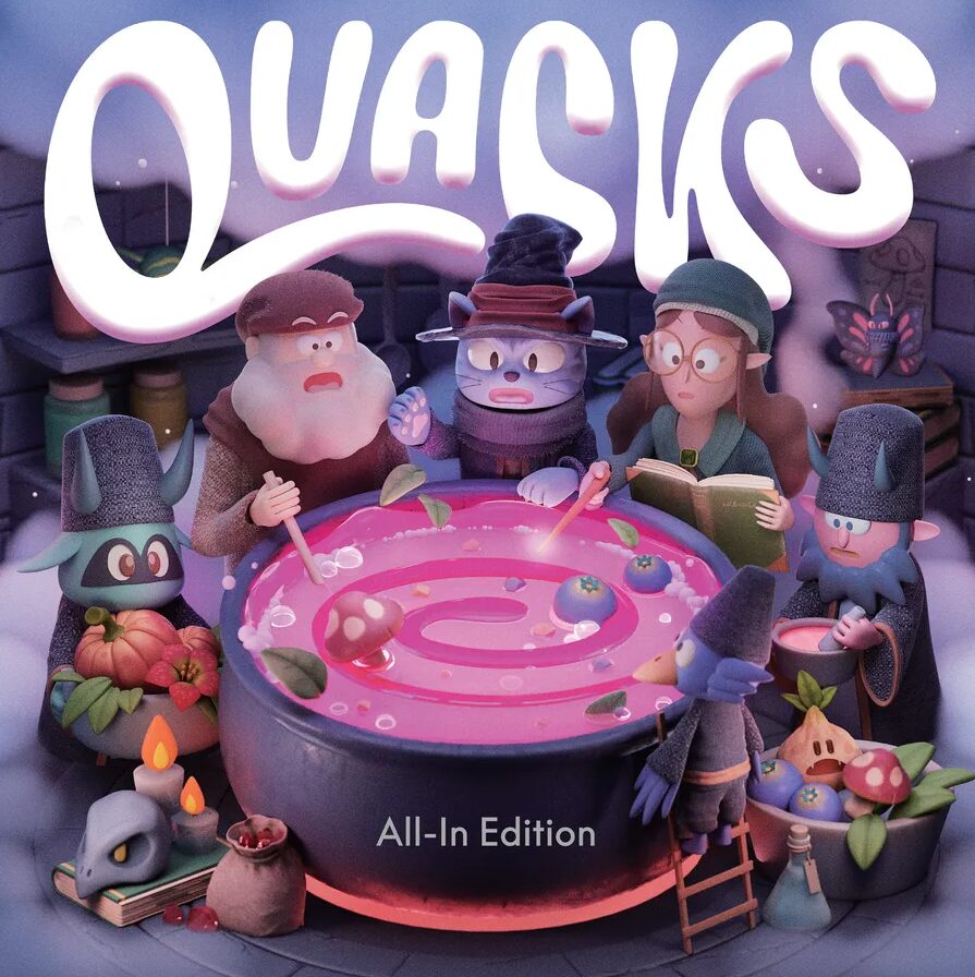
Few board game artistic redesigns of recent years have drawn as much polarising opinion as publisher CMYK’s recently announced reworking of Quacks of Quedlinburg, with online forums torn over the switch to the 3D clay-style imagery of Ryogo Toyoda. CMYK chief executive Alex Hague – the creative director for the redesign – spoke to BoardGameWire about the motivations behind changing up the look of Schmidt Spiele‘s million-selling game, and CMYK’s vision for breaking board games out of their ‘visual and demographic monoculture’.
BoardGameWire: What were your main thrusts for redesigning the game’s looks – what did you hope to achieve through the new visuals, for players and for the game itself in a retail environment?
CMYK CEO Alex Hague: Quacks is playful, chaotic, and unexpected – so we wanted the new art to capture exactly that energy! We also saw a chance for the game to stand out, drawing in folks who might overlook a more traditional looking design.

You brought in Ryogo Toyoda for the cover art, which is really striking. What was it about Toyoda’s style that made you reach out to him in the first place, and go forward with his designs?
We explored a few different styles early on, but once we saw Ryogo’s work, everything else went out the window. His style immediately captured the playful weirdness that playing Quacks FEELS like. We generally don’t like elaborate backstories in games – ultimately how the game feels and its visual world should imply everything you need to know as a player. And Ryogo’s work instantly draws you into a miniature world that’s bubbly and playful and tactile.
His art lets the visuals and actions speak for themselves without needing to spell everything out.
Were you surprised at the initial reaction from BoardGameGeek users about the new art style, or did you anticipate there would be pushback about the art design from some players?
Honestly yes! I like to think that we’re always pushing the taste level with each CMYK release, but I thought the Quacks redesign wasn’t as much of a radical departure as people clearly believe it is! There are so many lovely design features in Quacks that we had a principle of “do no harm” with the redesign. So a lot of the elements, like the cauldron and ingredient shapes, are completely preserved.
I think it comes down to Quacks being a beloved game that a lot of people have a deep relationship with. And it’s like when a company changes the packaging on your favorite ice cream – it’s a little jarring and you don’t know exactly why! But we also trust our process and know how good the work is – Ryogo himself said it’s his favorite work of his career – and we trust that once players see the new edition in person, they’ll feel the same warmth and fun that drew us to his style.
Would it be fair to say this edition is not really aimed at people who already have the game, or even at players already very into the hobby – but rather to attract new gamers to the hobby?
We want each CMYK release to bring new people into the hobby. So every decision we make is to do something a little out of the ordinary to hook a person who maybe doesn’t see themselves playing games yet. Boardgames are a bit of a monoculture, visually and demographically, and we’d love to do our part to break them out of that.
I was just looking at the stats for the Quacks how to play video, where a lot of the traffic came from BGG and r/boardgames. 95% of the viewers were men. 95! That’s bananas.
How important are strong visuals to CMYK generally, in terms of helping its designs stand out in the market / attract potential players?
I care so much more how a game looks on a person’s shelf than I do about how it looks at retail. Stores like Target will always be “away games” for us, because CMYK’s goal isn’t mass market domination: it’s nudging people richer, weirder, more interesting experiences.
What’s your favourite of the CMYK art designs you’ve published so far, and why?
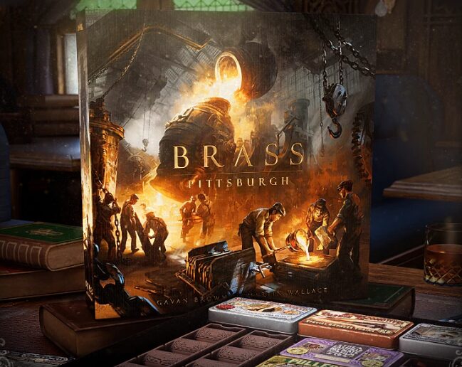
Everything we’re releasing this year is just on another level. Besides Quacks, Magenta took two year to get the product design, structural packaging, brand system, card materials, and everything else exactly right. I joke that I’ve been designing a box for two years, but it’s not far from the truth!

And upcoming this year is Magical Athlete, a couple more Magenta titles yet to be released – one of a beloved classic card game – and even more stuff that I think will really blow people away.
Is AI art something you’d ever consider for a CMYK game, either as a box design or in the game itself? Why / why not?
No with an asterisk. At least not in the way that it’s commonly understood as replacing human artists and saving money. But if it was a project that was impossible for one or multiple people to complete—say a game with thousands and thousands of unique cards – it could be interesting to work with artists to train models on their work, where it would still very much be theirs. But overall, I think the way AI art is being used is the opposite of that and very depressing. If we ever used it, it would be to enhance human creativity, not to stifle it.


[…] the name of Quacks of Quedlinburg designer Wolfgang Warsch or artist Ryogo Toyoda on the cover of its new version of the game, while its Magenta line of reimagined card games only features the name of one designer, Reiner […]